Now that it’s on top of the world, Crumbl Cookies is getting a bit of makeover. The cookie chain, founded in 2017, has been growing at a rapid clip, and now has more than 950 locations after just six years in business. It’s known for its rich and massive cookies and its weekly flavor rotations, and now that the brand has grown to nearly 1,000 shops, it’s changing its name and logo to better suit the business.
Crumbl is no longer ‘Crumbl Cookies’
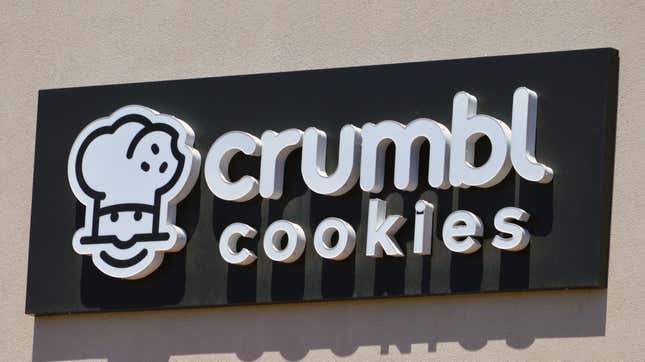
Industry publication Restaurant Business reports that Crumbl Cookies is dropping the word “Cookies” from its name, streamlining itself to simply “Crumbl.” The little baker mascot in the logo, aka “Bakerhead,” is being removed as well—and the brand is giving its logo a little extra pop of color by layering the name over a proprietary shade of pink developed earlier this year.
Crumbl has updated its social media avatars to reflect the change (though the Instagram handle is still crumblcookies). The new profile picture displays a black letter “C” over the signature pink color.
Some eagle-eyed Instagram followers of the Crumbl Cookie account had something to say when they noticed the profile changes on an Instagram Reel posted by the brand.
“Can you consult with me next time you change your profile picture,” one user wrote, while another asked, “where did the little chef go?” followed by a crying emoji.
That particular reel concludes with a sentence reading, “The Crumbl app has a new look” while showcasing its new app icon, before the video closes out. With 4.2 million Instagram followers, Crumbl was bound to hear something from fans about the brand refresh.
The rest of said refresh will roll out in the next few months. Co-founder and chief branding officer Sawyer Helmsley said in a statement, “This is not a complete rebrand, but rather enhancements to the brand we’ve built a solid foundation upon,” and that the goal was “to infuse new life and energy into Crumbl while maintaining our core values.”
Based off how quickly the brand is growing, the previous logo was due for a bit of a glow-up, considering that it was originally just a fairly plain black and white design. The new emphasis on pastel pink does evoke the idea of frosting and sprinkles, and putting customers in a sugar mindset is never a bad idea.