It doesn’t take a marketing genius to understand that brand imagery is key to attracting customers. Certain colors or a particular font could be the difference between someone placing a snack in their cart or just breezing right by it at the grocery store. A logo is meant to convey a lot of information in a infinitesimally small amount of time; to condense all that meaning into one image, designers have to speak to our subconscious.
These food brands have secrets within their logos that are, in fact, not that secret at all—they’re on display for the world to see. But since the products are so ubiquitous, you might not have noticed their layered meaning until now.
Baskin-Robbins
The current iteration of the Baskin-Robbins logo contains a nod to its history,
Reader’s Digest explains. The ice cream shop was first founded in 1953 by Burt Baskin and Irv Robbins, and since then has always been proud of its broad selection of flavors.
The idea behind offering 31 flavors of ice cream was that customers could literally come in every day of the month and try something new. Other ice cream spots at the time didn’t offer such a wide variety, and the founders were so proud of this fact that they made a point to emphasize it in the original logo design.
The original Baskin-Robbins logo had the number 31 prominently displayed above the name. In 2006, a new Baskin Robbins logo debuted that nestled the number right into the curve of the “B” and the straight line of the “R,” offsetting the hidden numbers with pink lines in contrast to the blue ones. By 2022, the logo underwent another change, ditching the navy blue and going with a bolder font—but the pink number 31 remains highlighted within the letters B and R.
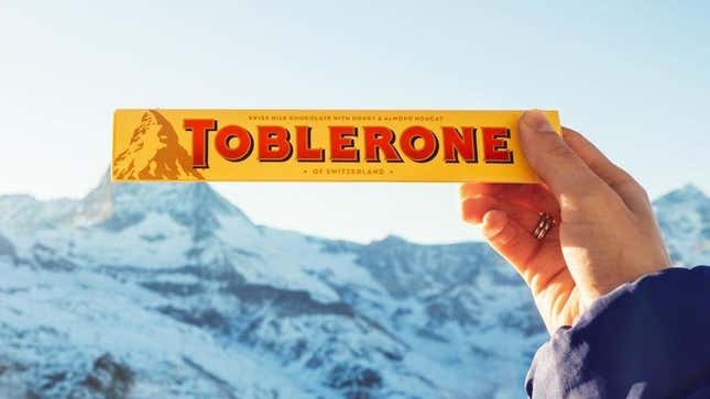
Toblerone
This bar of chocolate is best known for its unique triangular shape, but even as its packaging undergoes changes, the brand is still set on keeping some subtle imagery within its logo.
Fans of Toblerone can picture the label with its classic image of a mountain, an homage to the bar’s origin country of Switzerland. Within that mountain, though, there has also always been the outline of a bear. The hidden bear is believed to be a species native to Switzerland, and its inclusion on the label is a nod to the Swiss town where it is made, which is known as “the city of bears.”
However, it was recently announced that part of the chocolate’s production will be moving to Slovakia, and under Swiss law, the mountain logo, connoting that the product is made in Switzerland, has got to go. Thankfully, Toblerone has no interest in completely erasing its history. The brand announced that a “modernized and streamlined” mountain will appear on the new packaging while maintaining the hidden bear as well.
7-Eleven
The rhyming name of this convenience store chain has both a name and a logo that perplexes detail-oriented people. Wouldn’t it be tidier to write “Seven-Eleven” or “7-11"? Why not “7/Eleven”? Doesn’t the numerical “7” just look wrong at the start of a sentence? Knowing the chain’s history clears some of this up.
Per Reader’s Digest, 7-Eleven was formerly a collection of ice houses and filling stations known as Tote’m Stores. In 1946, to reflect the newly expanded store hours of 7 a.m. to 11 p.m. and to use them as a marketing tool, the brand became known as 7-Eleven. Eventually store hours expanded to 24 hours a day, seven days a week, but the company retained its name and logo.
From 1946 to 1969, the logo was a large “7" with the word “eleven” cutting through it in all capital letters. It has barely deviated from that design since—except that nowadays, the “n” in “eleven” is the only lowercase letter.
The exact reasoning for the lowercase letter has not been pinpointed, but 7-Eleven claimed to Reader’s Digest that the wife of a previous brand president thought all capital letters came off a bit harsh and the lowercase letter would help soften the logo. For grammar buffs and other sticklers, this is quite irritating, and for the newbies who never noticed the discrepancy before, I’m sorry, but you’ll never unsee it now.
What other revelations might you stumble upon at the grocery store? Start squinting really hard at the aisles to find out.